
I did not want to keep charts open all day just to know what was happening in the markets. I did not want to give up half a window to a dashboard, or keep checking my phone while I was working either.
I wanted market awareness to stay available without becoming the thing I was focused on. That became MarketPulseBar: a native macOS menu bar app for watching stocks, crypto, ETFs, forex, indices, and commodities at a glance.
If you want to see the app in its current form, take a look at MarketPulseBar on the apps page.
The problem with watching markets while working
Most market tools assume you want a dashboard. They give you charts, news panels, watchlists, indicators, and more data than you can comfortably process in a small glance.
That is useful when you are actively researching or trading. It is less useful when you are writing code, working with a client, or trying to stay focused while still knowing whether something important moved.
I wanted a smaller layer of awareness: current prices and movement in the place I already look, without opening another app or browser tab. The menu bar was the obvious place for it, but it also created a difficult design constraint. There is not much room, and every extra symbol makes the whole interface harder to read.
What MarketPulseBar does
MarketPulseBar connects to Yahoo Finance as a free market-data source. It supports the symbols and instruments available through Yahoo Finance, including stocks, crypto, ETFs, forex, indices, gold, silver, and other commodities.
The app is built around a configurable watchlist. Add the symbols that matter to you, choose how much information to show, and keep the result visible while you work.
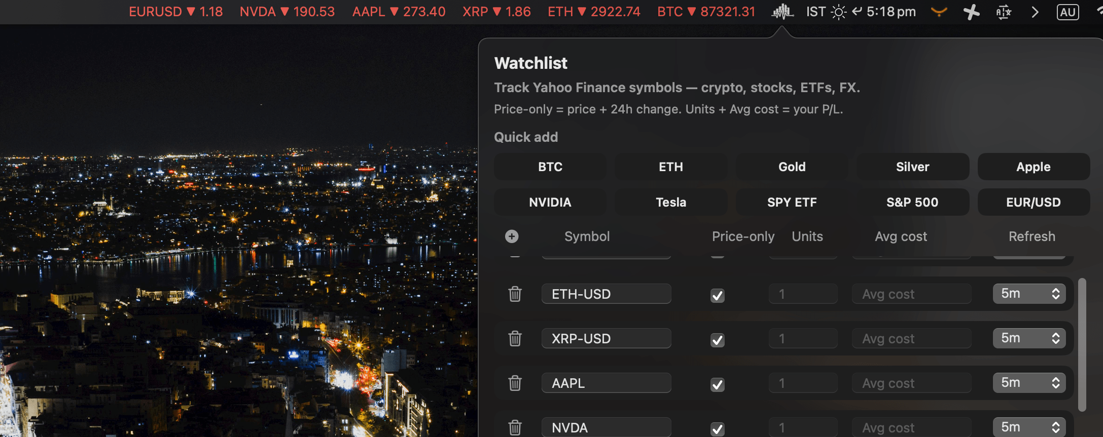
Price-only mode
Price-only mode keeps the menu bar focused on the current price and movement. It is useful when you want a quick read without entering portfolio details or opening a larger interface.
Portfolio mode and P/L
Portfolio mode lets you add units and average cost to a position. MarketPulseBar can then show your current profit or loss at a glance instead of making you calculate it separately every time you check a price.
The goal is not to replace a full brokerage or charting platform. It is to answer a simpler question quickly: how are the things I care about moving right now, and how is my tracked position doing?
Alerts and compact watchlists
Configurable watchlists keep the app useful for different kinds of market watchers. You can keep a short list of a few important symbols, or follow a broader mix of equities, crypto, ETFs, currencies, and commodities. Price alerts add another way to notice movement without staring at the menu bar.
Solving the tight Mac menu bar problem
The hardest part of building MarketPulseBar was showing more than one symbol in a very small space without turning the menu bar into a wall of tiny text.
The solution was to let the information move. Depending on the selected mode, symbols can appear side by side, rotate through the available watchlist, or combine fixed symbols with a rotating group.
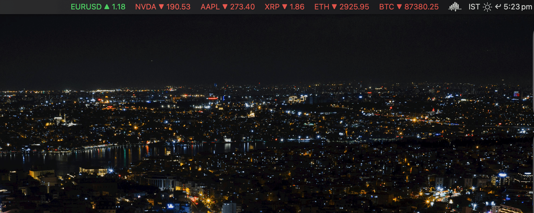
Multi mode
Multi mode keeps several symbols visible at the same time. It works well when you have enough horizontal space and want a broad snapshot without opening the popover.
Rotate mode
Rotate mode cycles through the watchlist. Each symbol gets a short turn in the menu bar, so a larger watchlist can remain available without showing everything at once.
Hybrid mode
Hybrid mode combines both approaches. You can keep the symbols that matter most visible while the remaining symbols rotate through the available space.
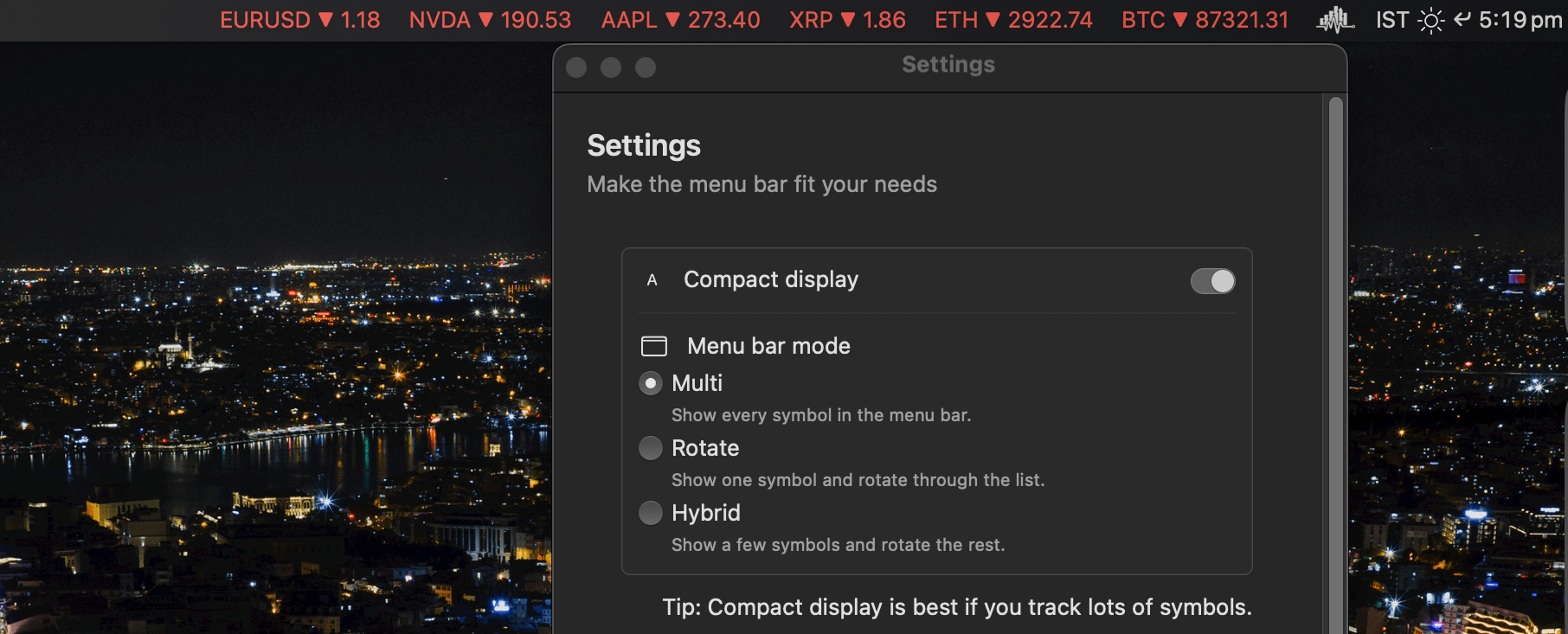
Compact mode
Compact mode shortens ticker symbols and reduces visual clutter. It is designed for smaller displays and for anyone who wants the least intrusive version of the app.
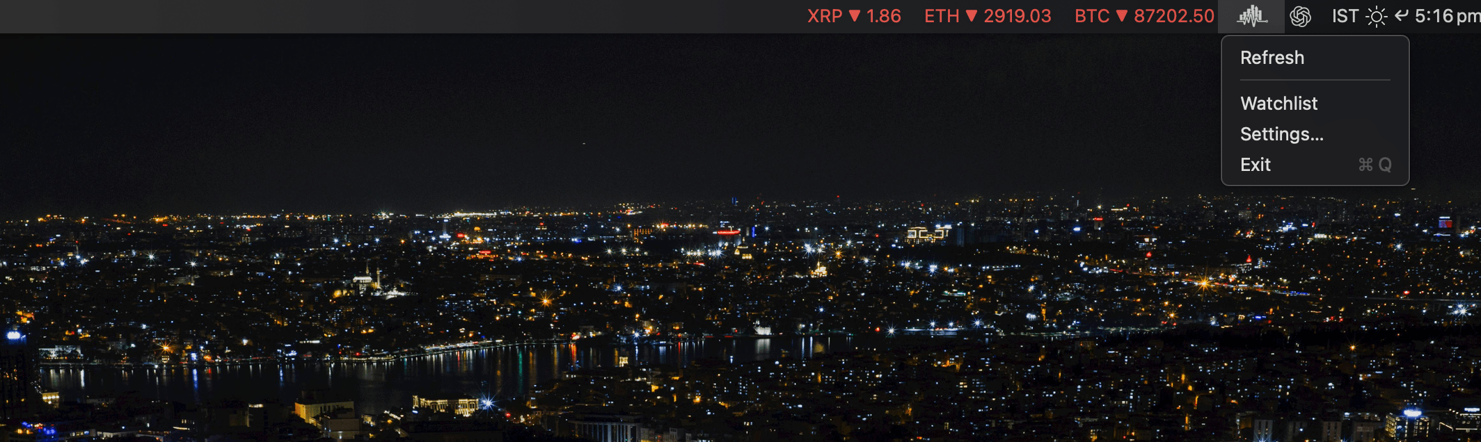
Building a native macOS market tracker
I designed and shipped MarketPulseBar independently in Swift and SwiftUI. It uses MenuBarExtra so the product behaves like a focused menu bar utility rather than a conventional app window with a permanent dashboard.
The sparklines are drawn with SwiftUI Canvas. They provide a small visual signal about recent movement without turning the app into a charting workspace.
The data layer also needs to behave responsibly. MarketPulseBar adapts its polling cadence, backs off when appropriate, and caches the last available values so the interface can start quickly and remain useful when a request is delayed. The exact market coverage and symbol behavior follow what Yahoo Finance supports.
This is also why I treat the app as a native product rather than just a small web view. The interaction model, the menu bar constraints, the display modes, and the background behavior all need to feel natural on macOS.
For a related project, I later used Yahoo Finance as the foundation for FinMCP, a financial data MCP server for AI assistants. The two projects solve different problems: MarketPulseBar is for fast personal awareness, while FinMCP makes financial data available to software and AI workflows.
What I learned from shipping it
The most important lesson was that a focused product can be more useful than a feature-heavy one. MarketPulseBar does not try to become a complete trading terminal. It stays close to one job: keep market information visible without taking over the screen.
That focus also made the design decisions clearer. Every feature has to justify its place in a small menu bar surface. A watchlist, a display mode, a sparkline, or a portfolio field is useful only if it helps someone understand what is happening quickly.
Building and maintaining the app also reinforced how much of a native product exists outside its main screen: refresh behavior, caching, display changes, compact layouts, settings, and the small interactions that determine whether a utility feels dependable over time.
Who MarketPulseBar is for
MarketPulseBar is for people who want a quick view of markets while working: investors, developers, traders, researchers, and anyone who checks a small set of symbols throughout the day.
It is not intended to replace a full charting platform, brokerage account, research terminal, or financial adviser. If you need deep technical analysis, order execution, or extensive historical research, a dedicated market platform will be the better tool.
If you want a quieter way to keep an eye on prices while you work, see the full MarketPulseBar feature list, screenshots, and demo.
MarketPulseBar is a personal productivity tool, not financial advice. Market data coverage and availability depend on Yahoo Finance and the symbols it supports.
A calmer way to watch the markets
I built MarketPulseBar because I wanted to notice what was happening in the world without spending the whole day watching charts. The result is a small native Mac app that keeps the signal available, then gets out of the way.